Miel
Brand Identity.
Brief:
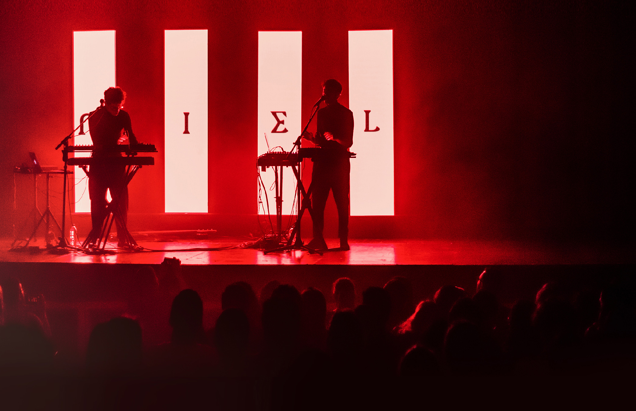
Miel is a band that fuses some genres but it can be defined in Electro Indie, as they call it, it is music to melt but always with unexpected and powerful sounds, so although it is "sexy" music, they have contrasts with hard and dry bits typical of Techno, it is a band that can be heard or danced so what they were looking for is a diverse, timeless logo that has force regardless of the graphic line through which the band travels.
Project:
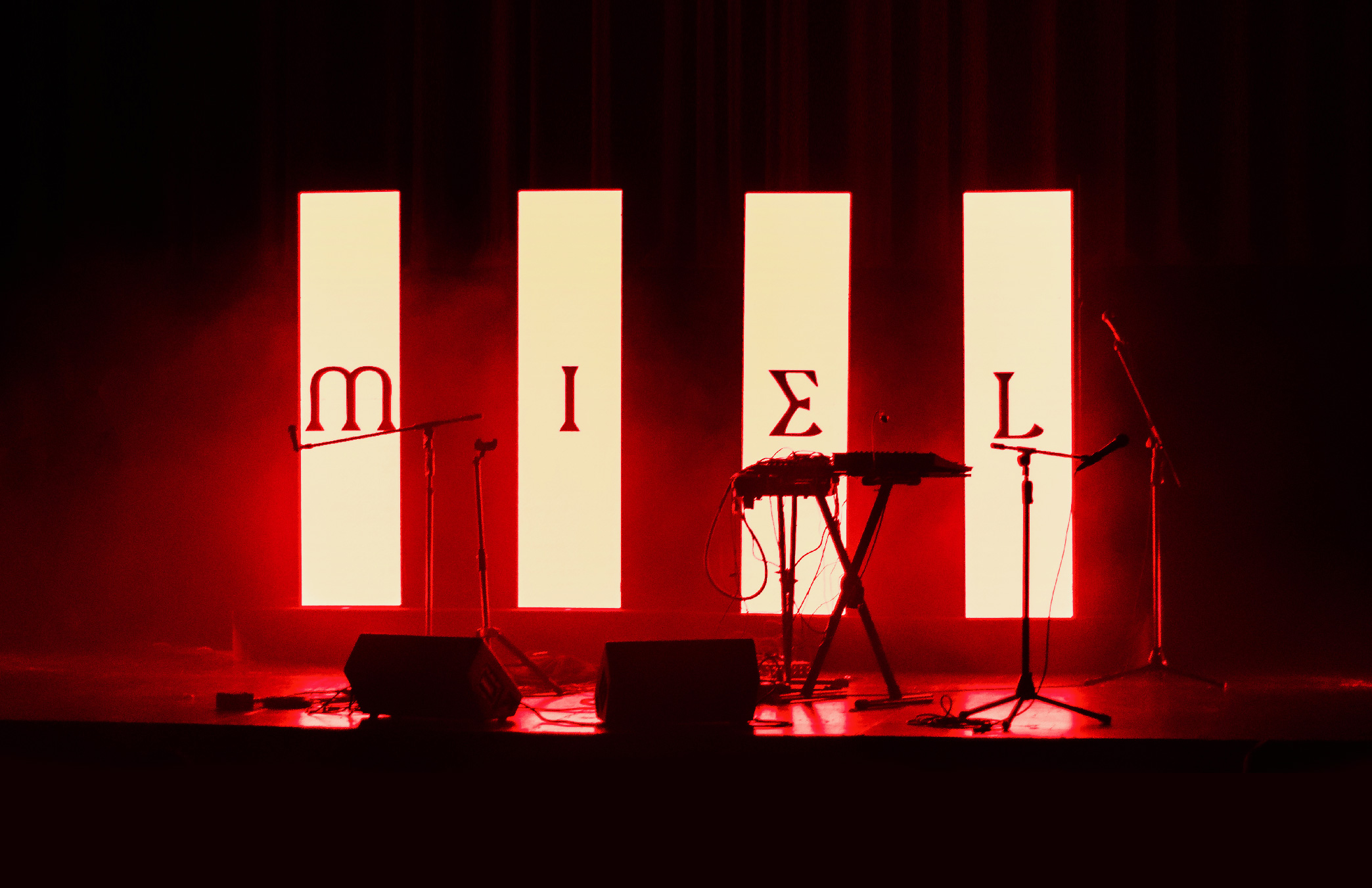
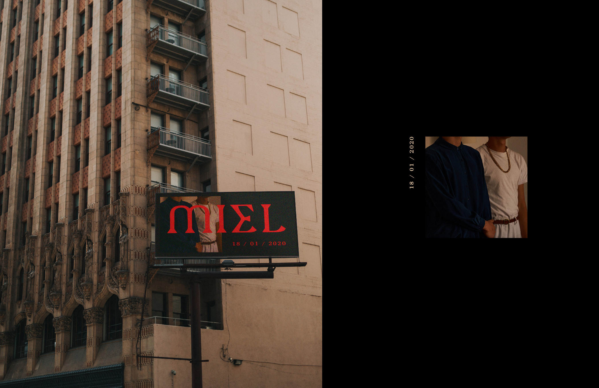
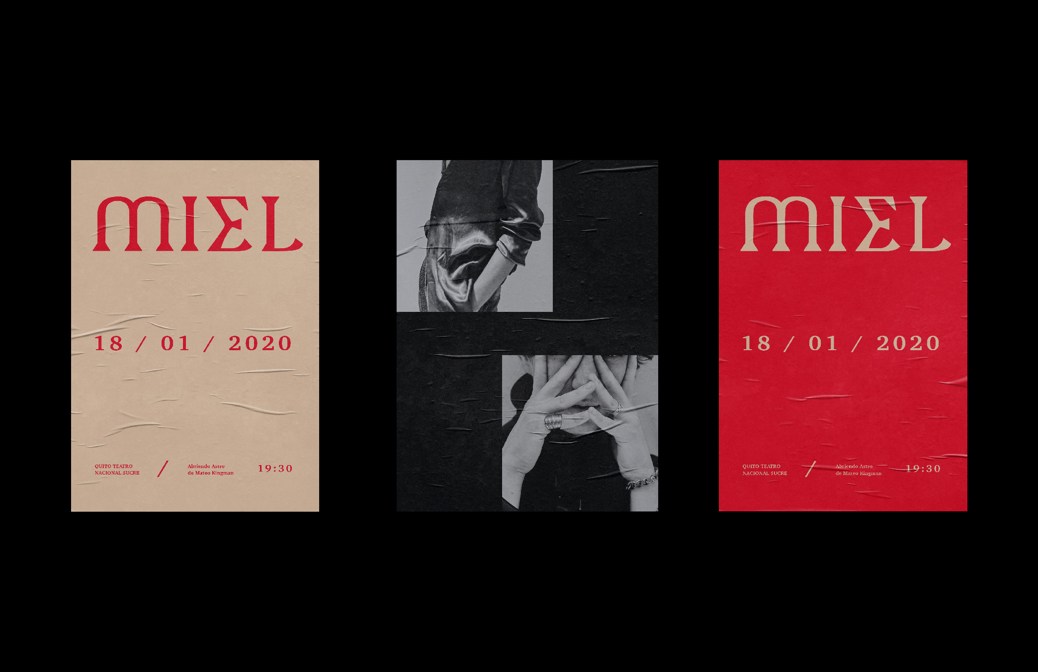
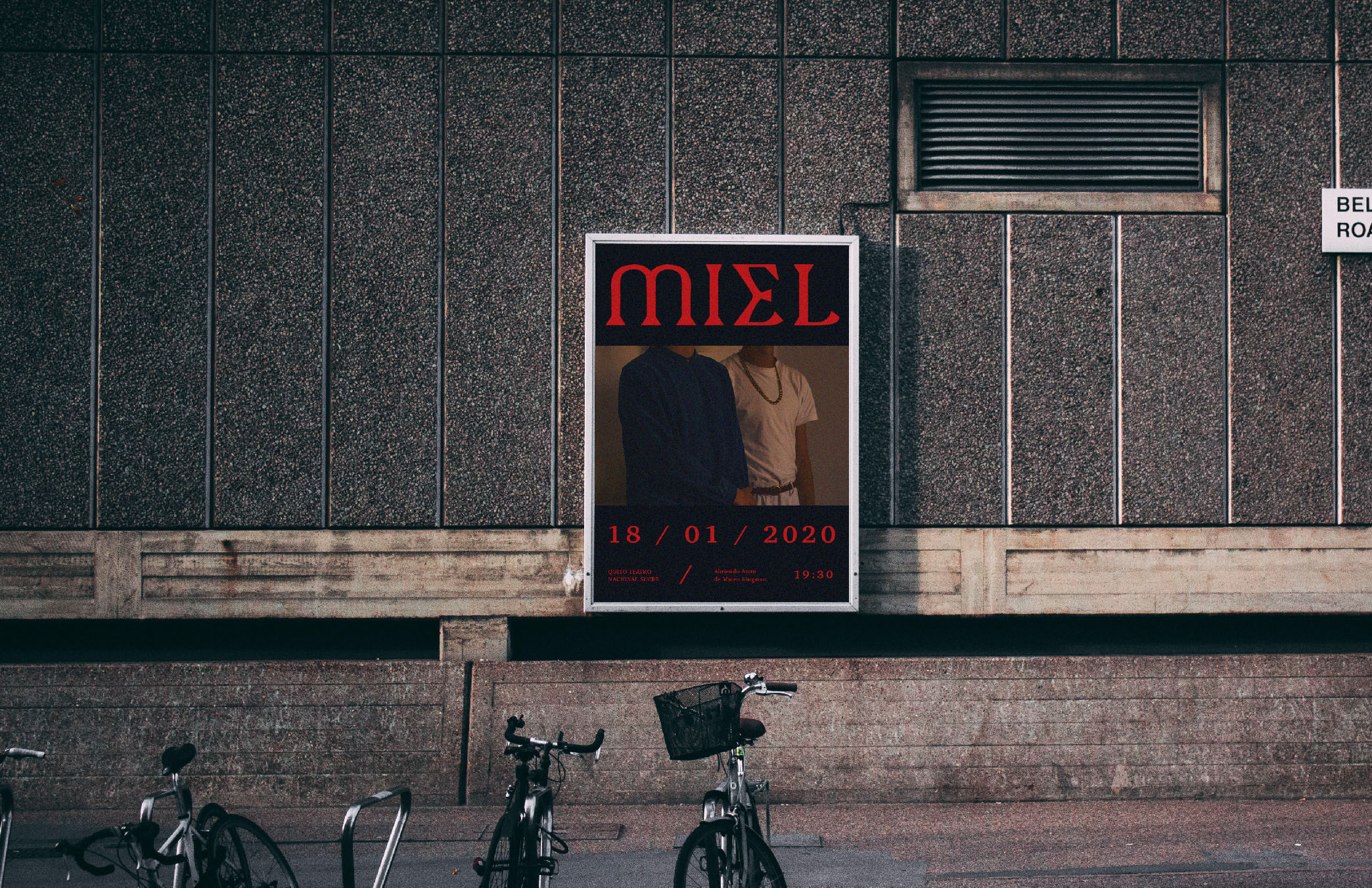
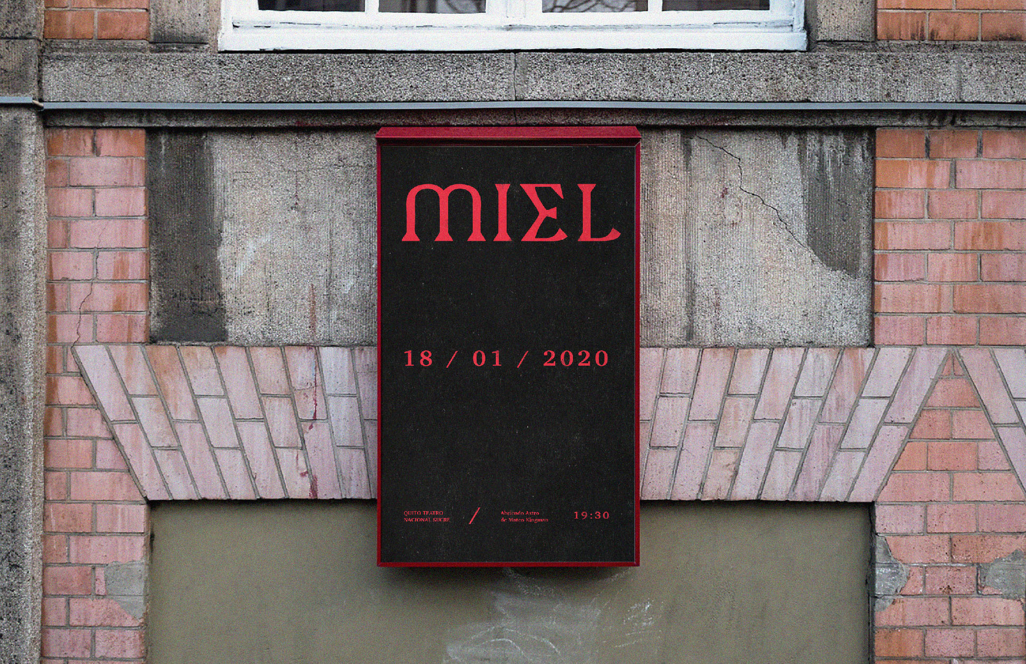
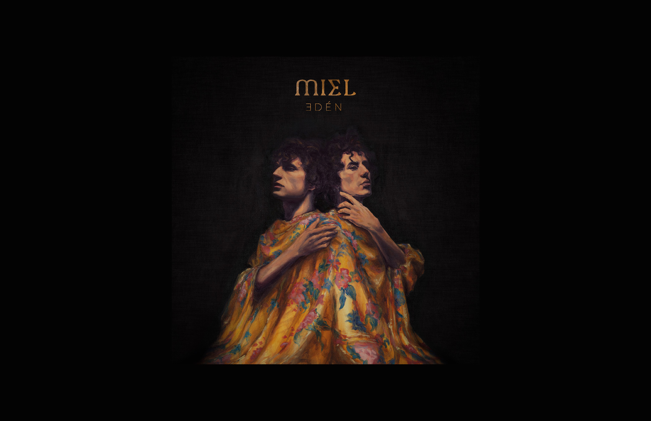
Next to Buenavetura.tv we decided to work with a typographic logo, so we generated a typeface with a very geometric serif to have an elegant and bold logo at the same time with a letter "E" that refers to ancient symbology, which can coexist in the past or the future, something that has always been and will be. And that gives strength to any communication piece that the band generates.
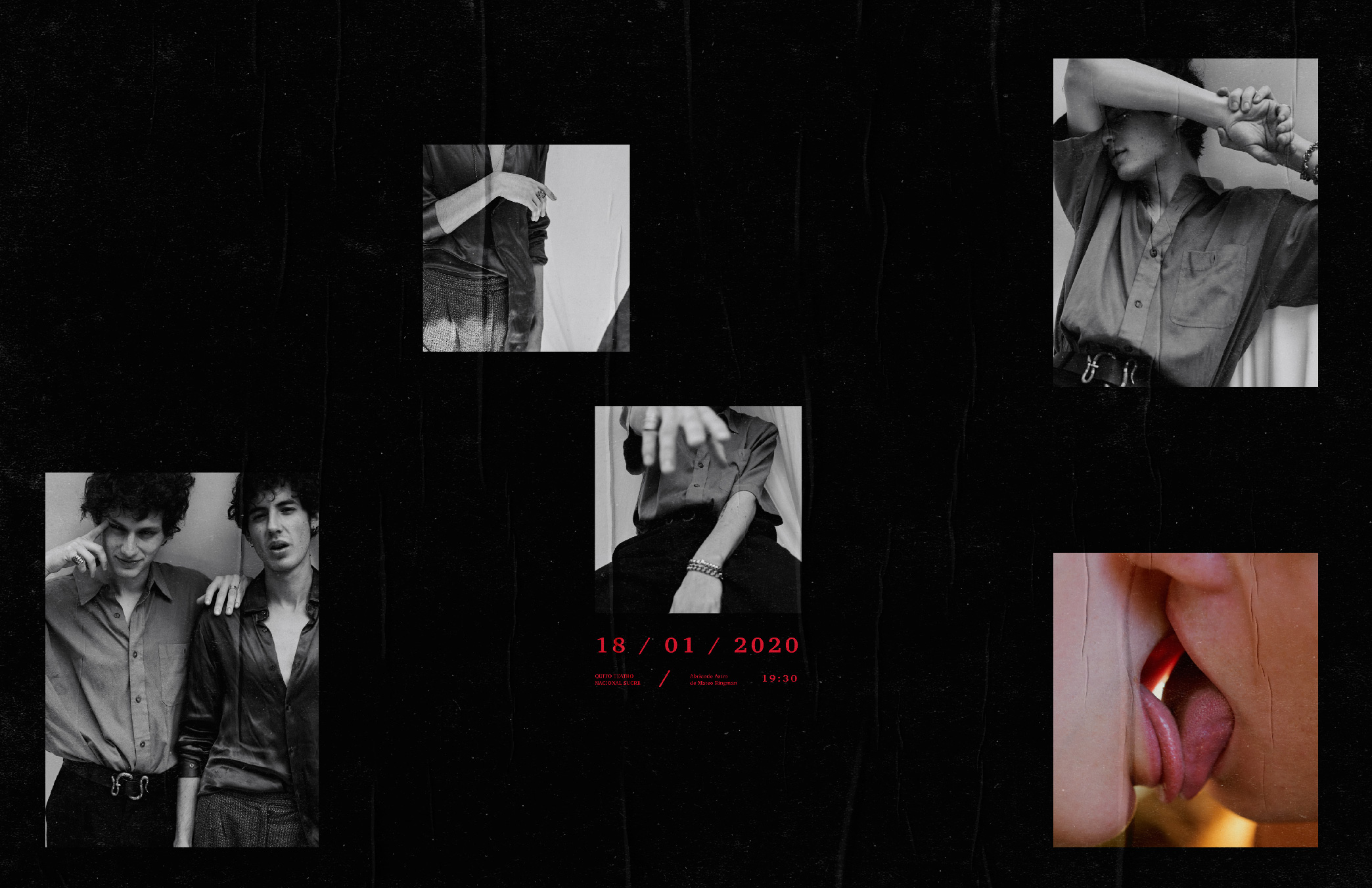
Photos by: Saúl Endara, Fernanda Arias and Steve Mallitasig
Edén Album oil Painting: Irving Ramo